Making Of Cáelunárra Map Design
Showing you insights into the project I had with Scott A. Hatfield Jr.

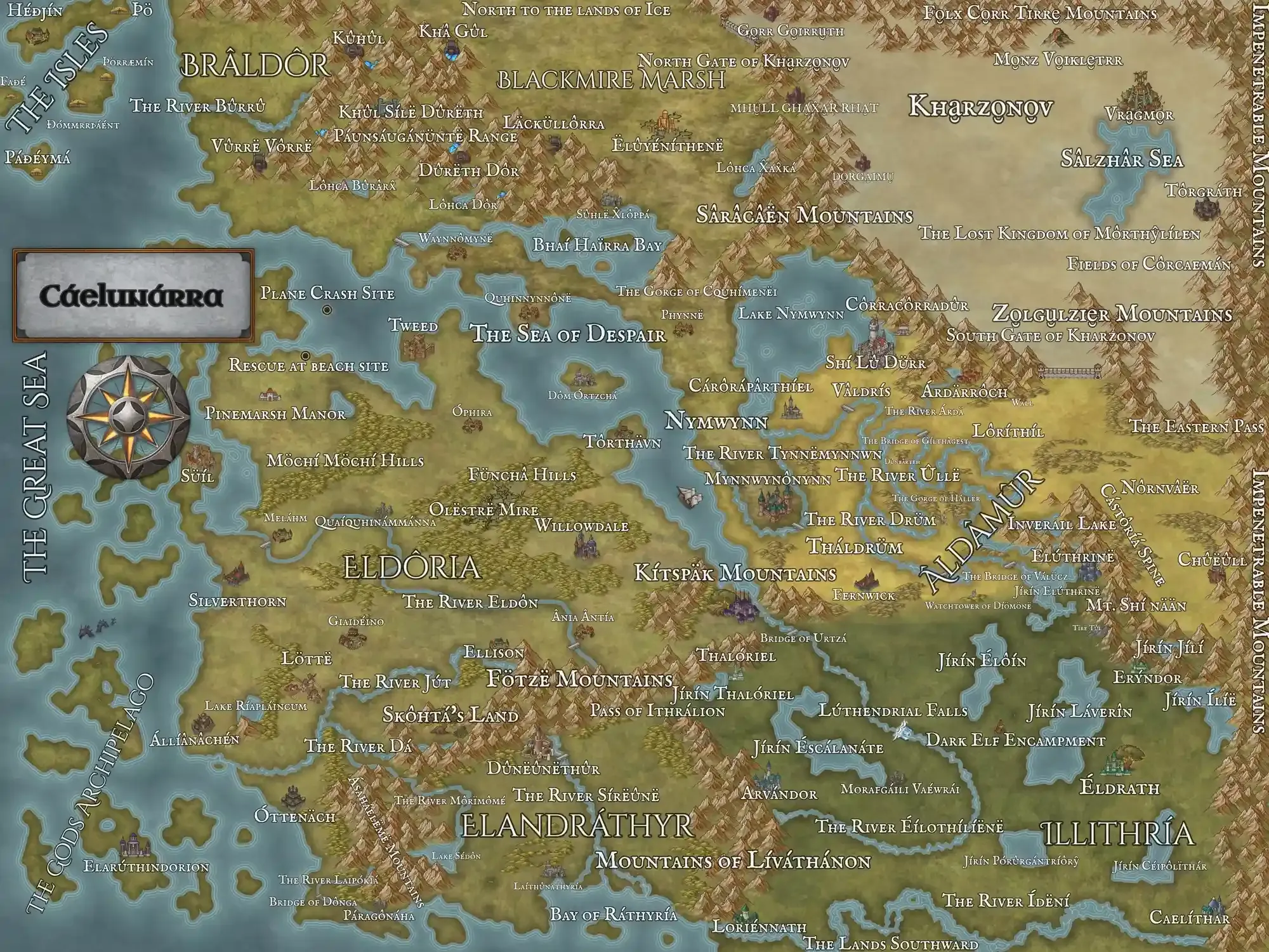
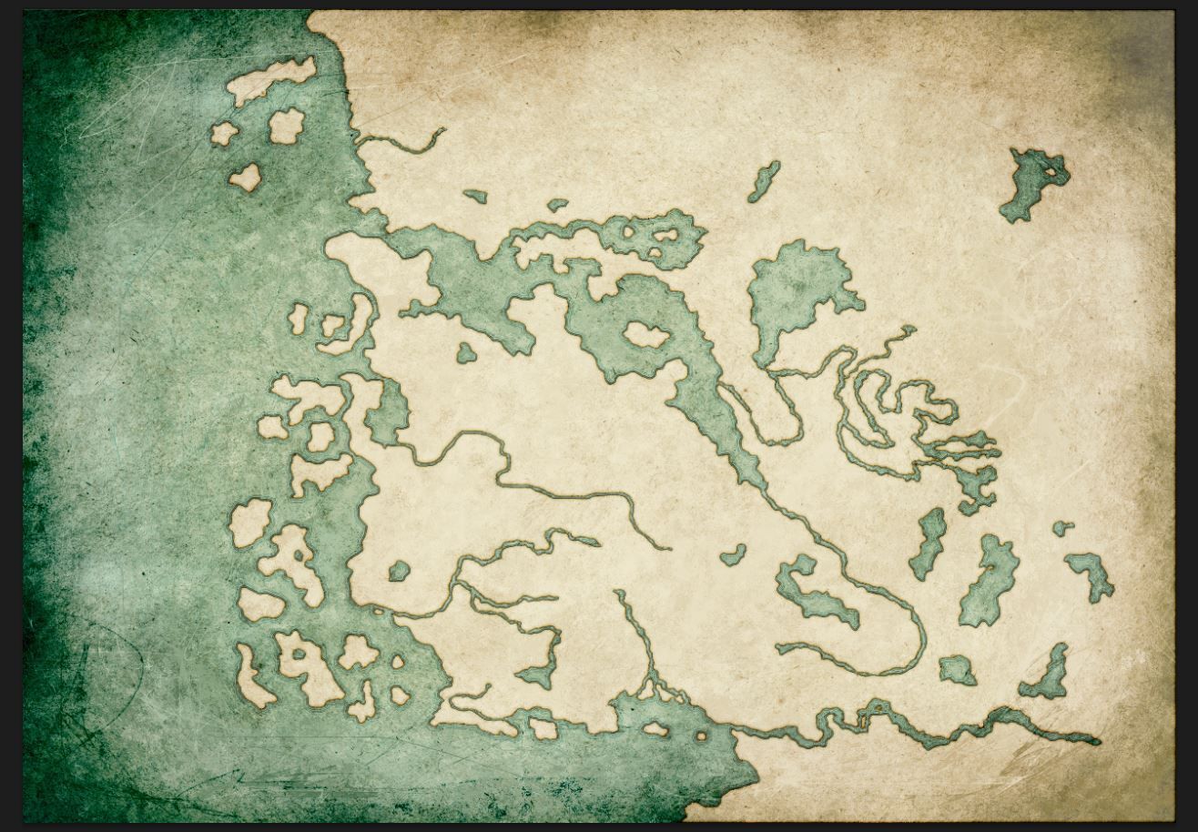
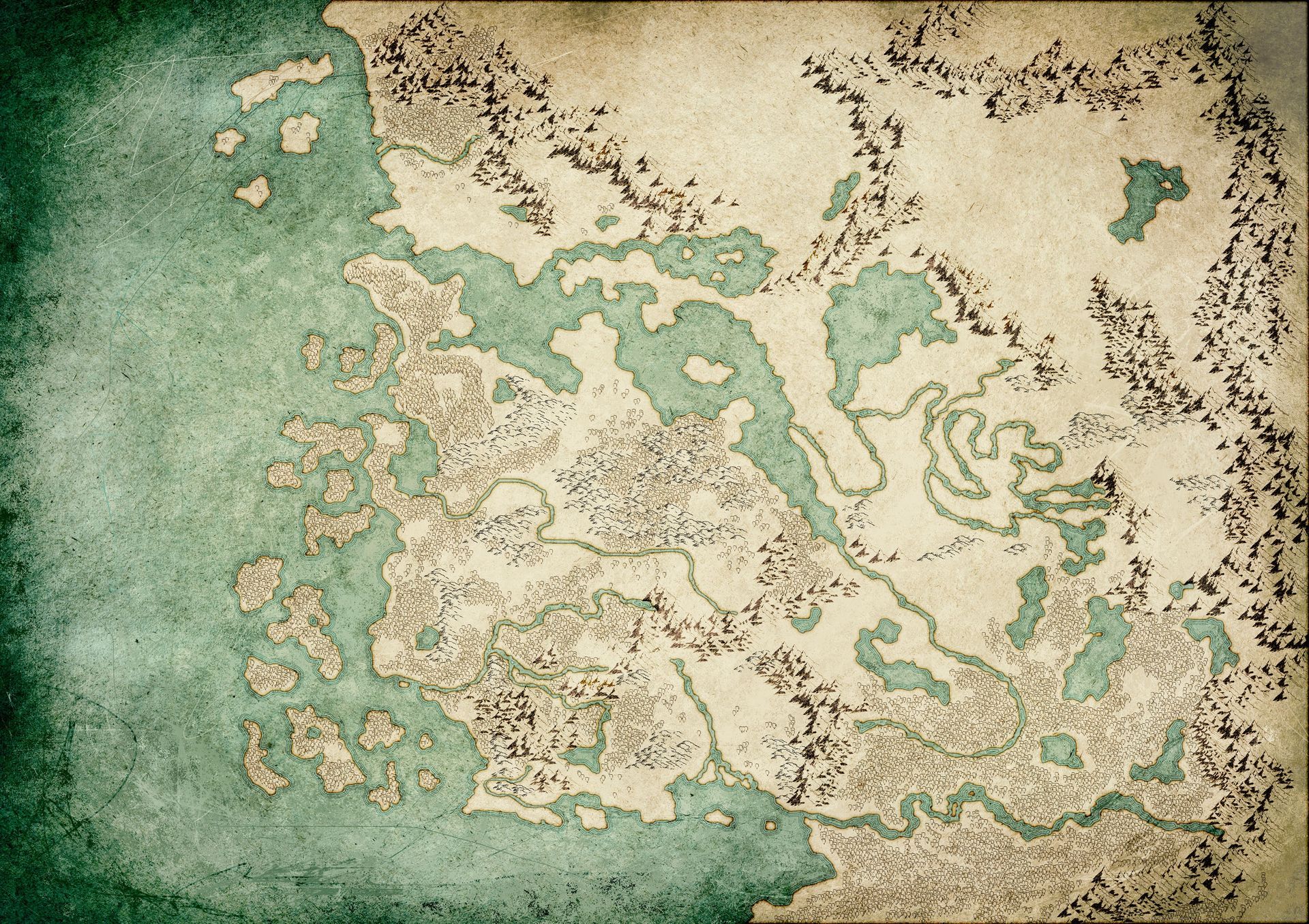
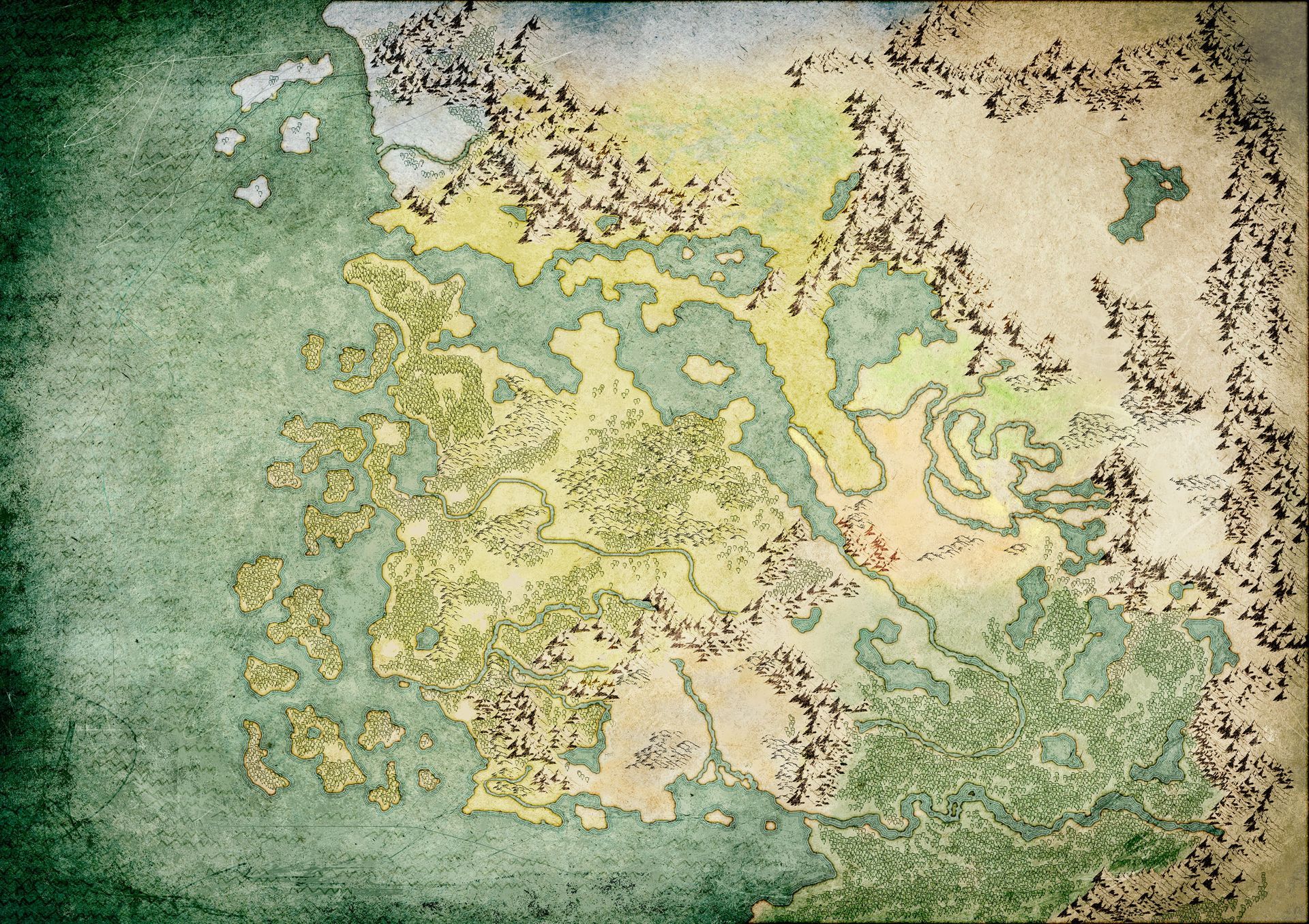
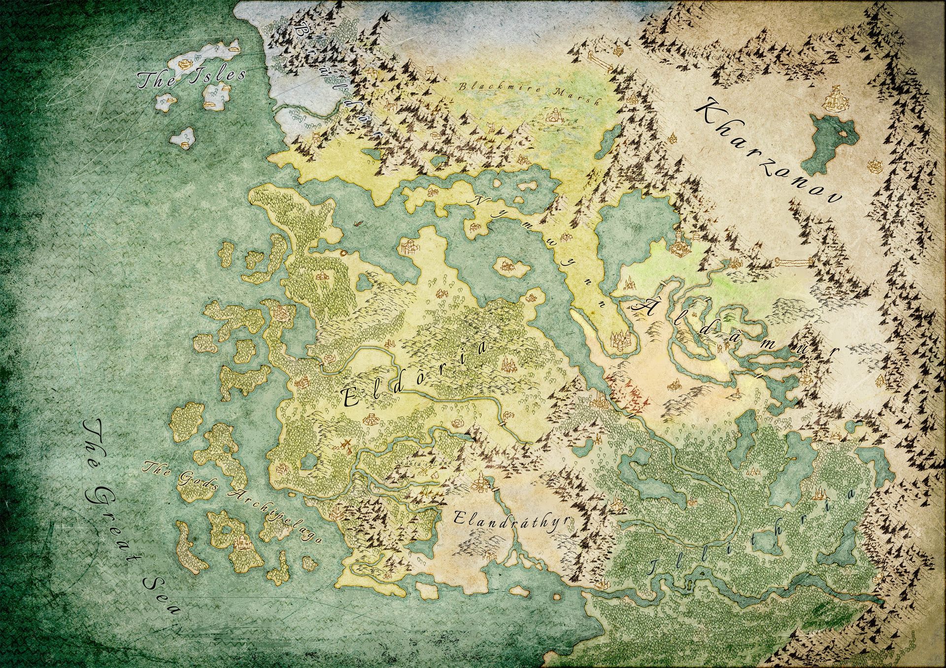
The finished map.
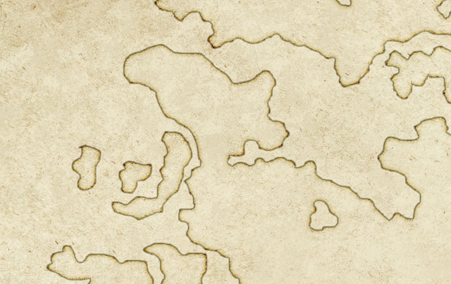
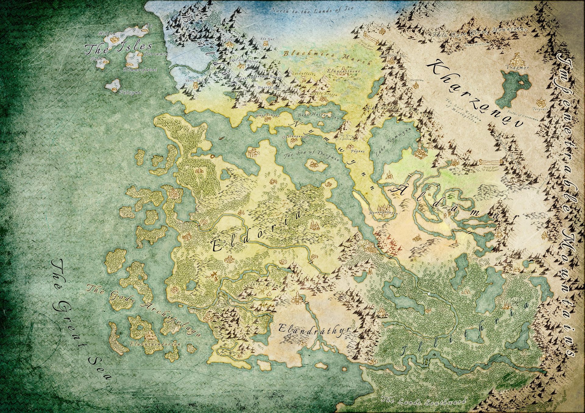
Scott's reference from Inkarnate.
1. Paper Texture and Outline of the Continents
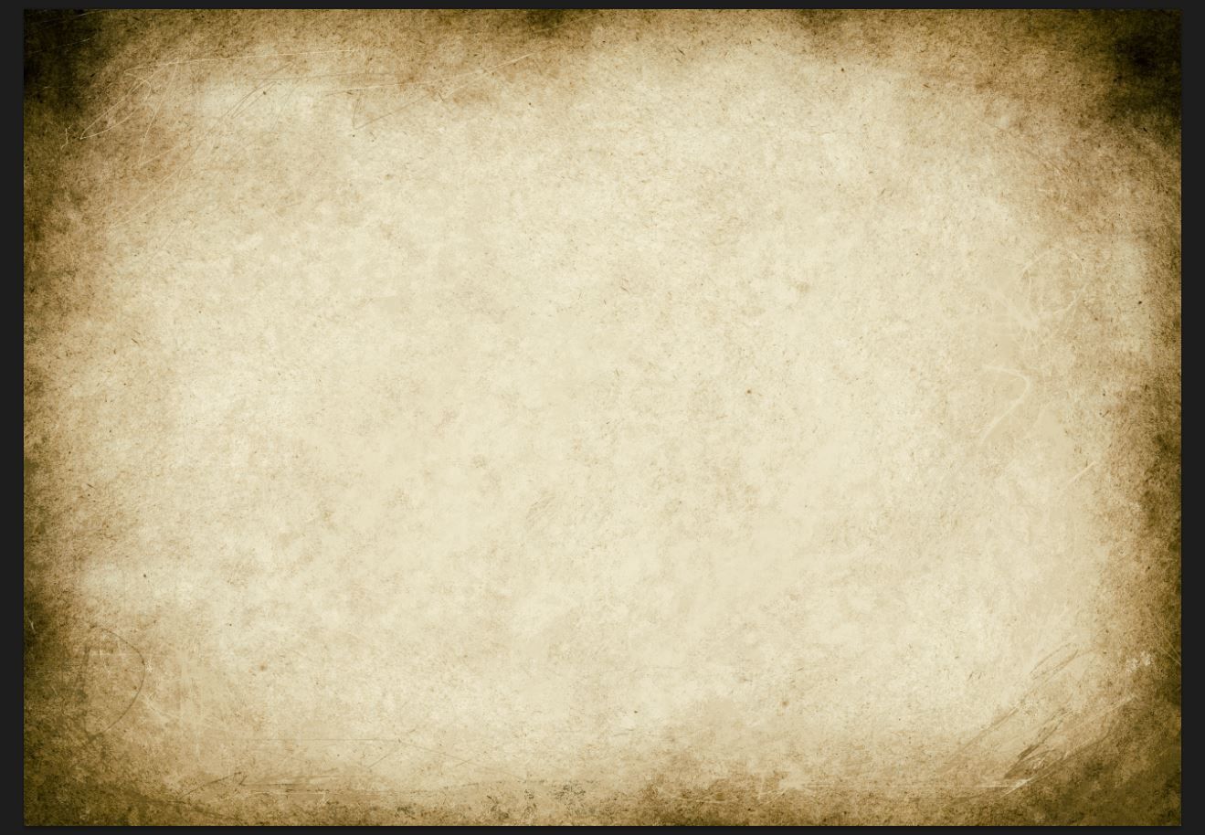
First of all, the base textures are made. Those are photos of old paper and as you can see, I also painted on top to have a sense of an old kind of drawing. You could also just do photos of coffee stains on a white paper and use that as an overlay texture.
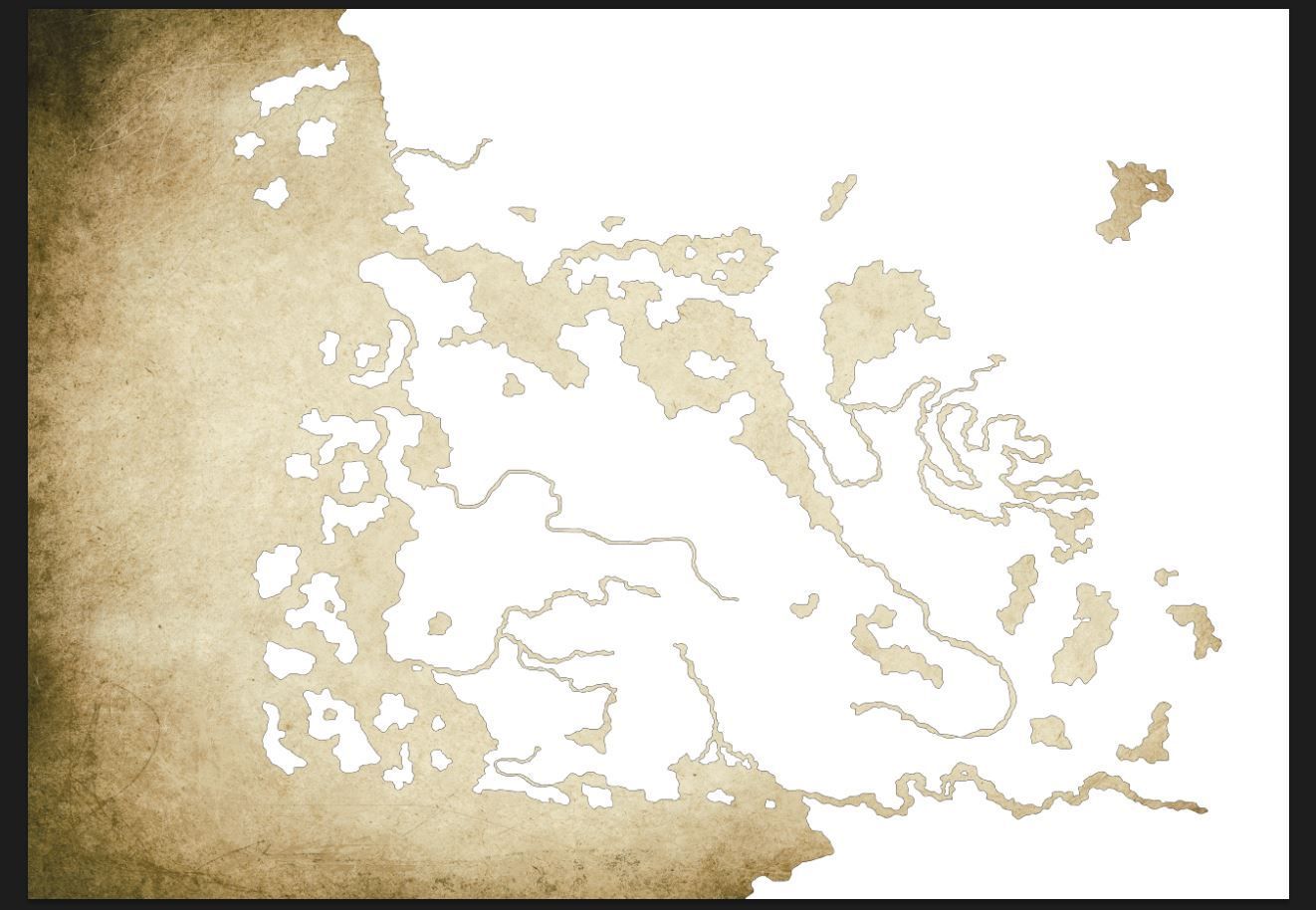
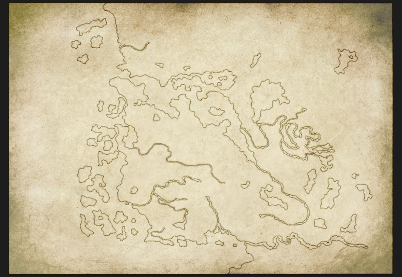
After that a white outline of all the landmasses is made. In Photoshop, there is the possibility to set the fill of the layer to 0% and that will only show the layer effects like outlines, inside shadows and outside shadows.
A zoom in on the outlines. There you see how the inside shadow I set to colour burn and setting the opacity to around 20% or lower. This will preserve the texture below.
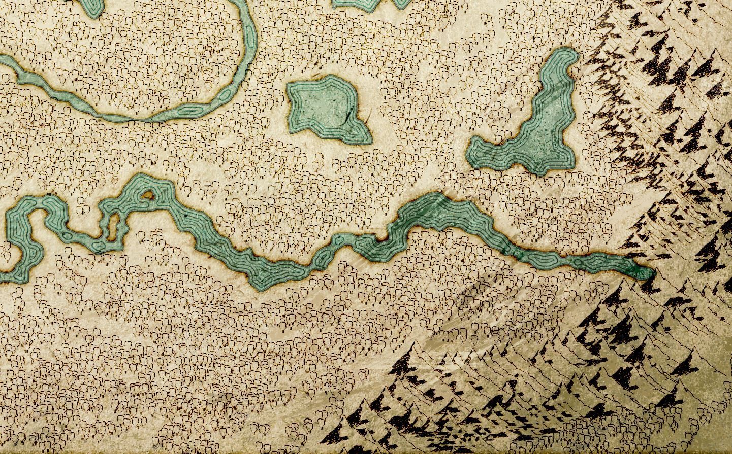
2. Ocean Coloration and Continent Outline Design
Selection of the landmasses has been made, and that means we can add colour to the ocean and water bodies. There I took a blue colour and filled the whole water, set the water layer to colour burn(preserving textures below) and set opacity to a lower number.
For the outlines I went into the layer settings and set it up to have three lines, which look like waves at the edges.
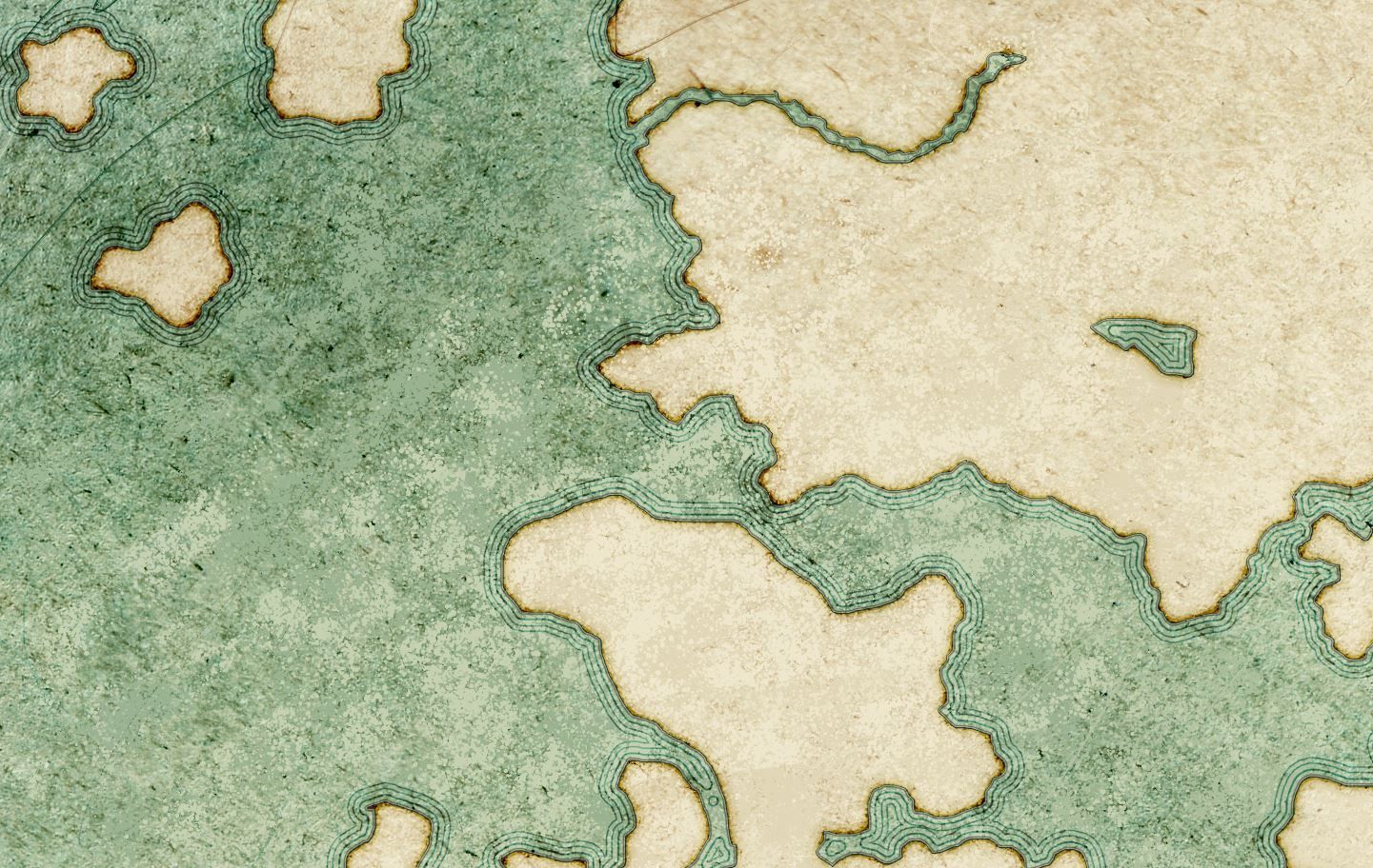
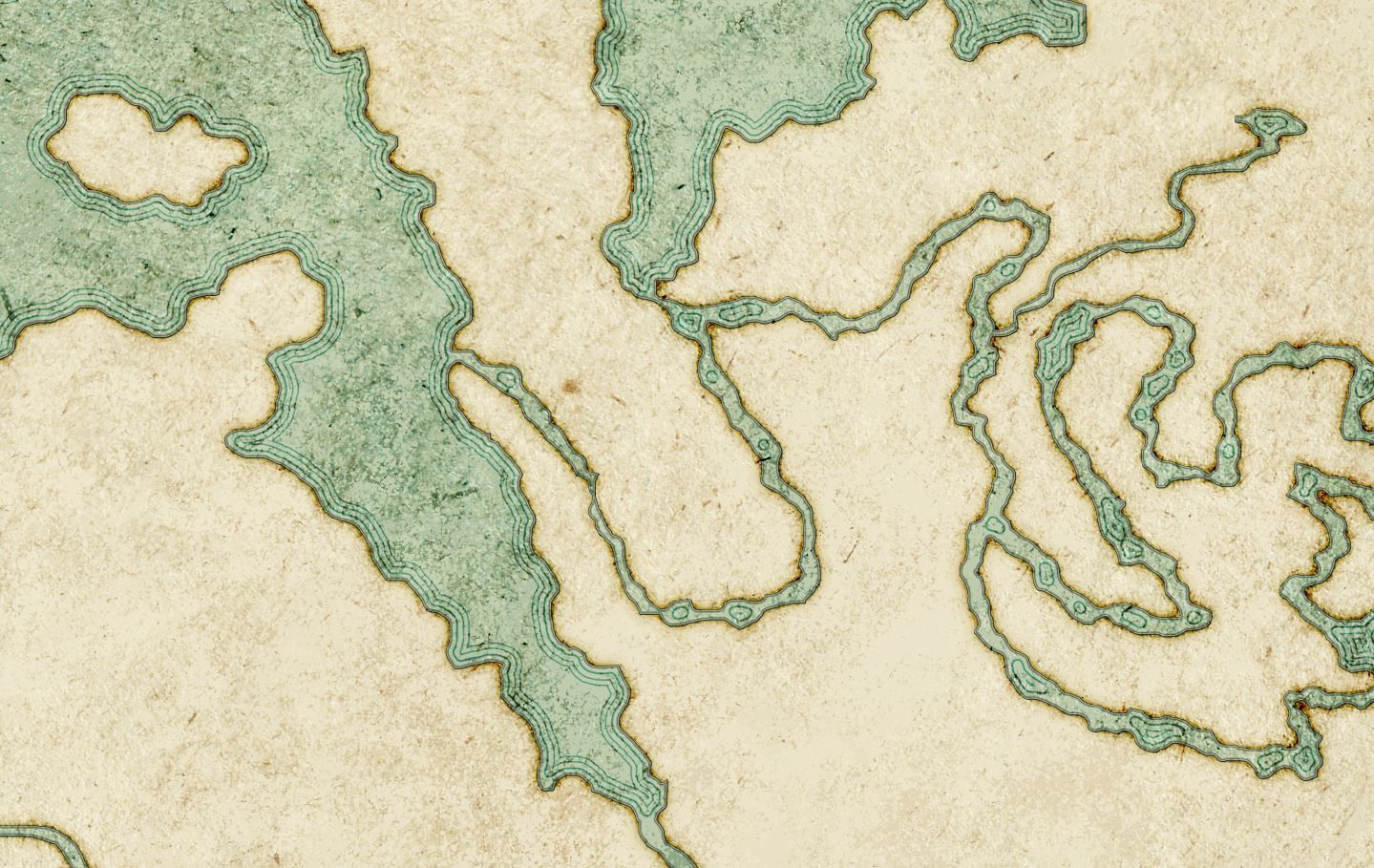
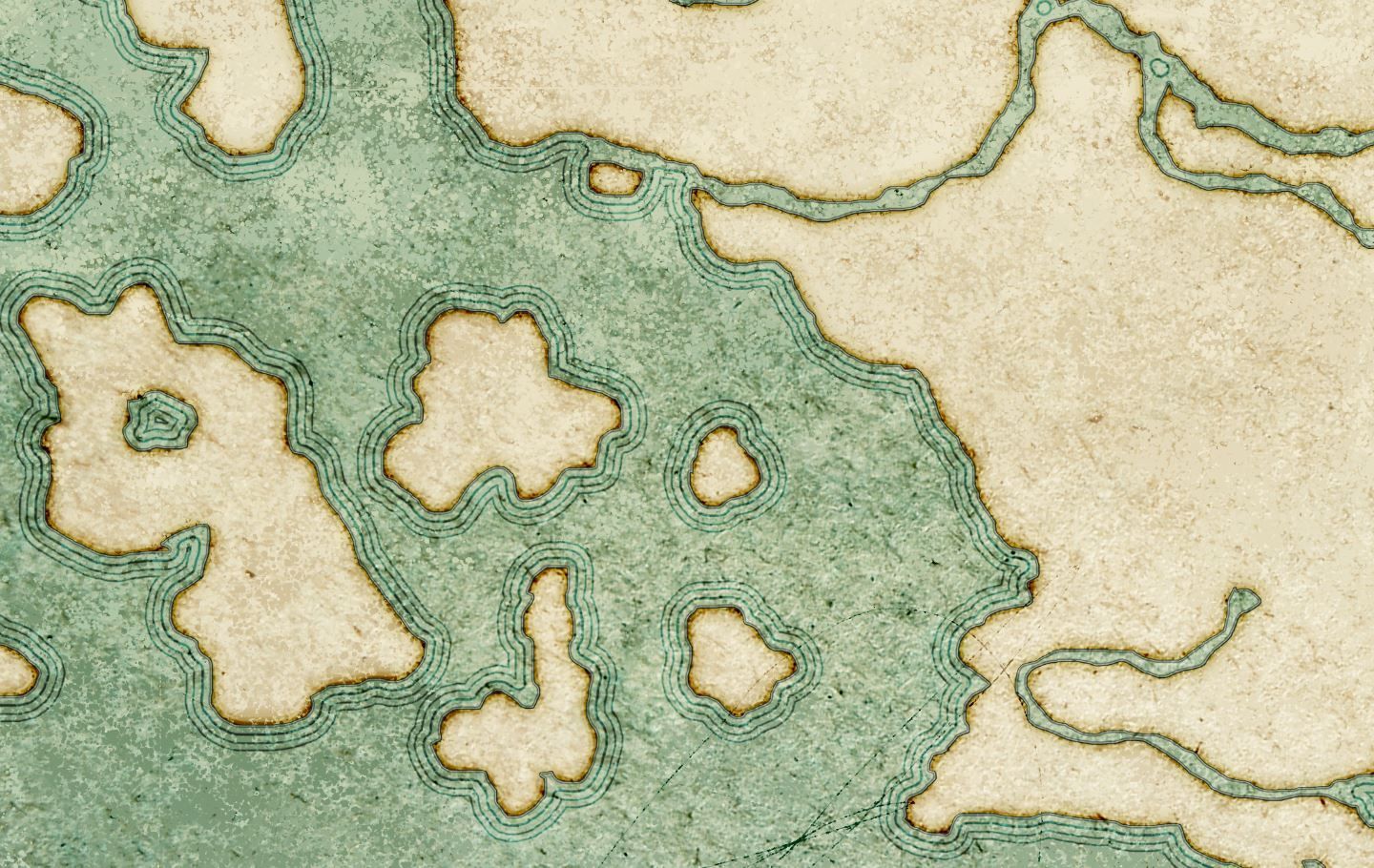
A zoom in on the outlines. Different screenshots on how those affect different lands.
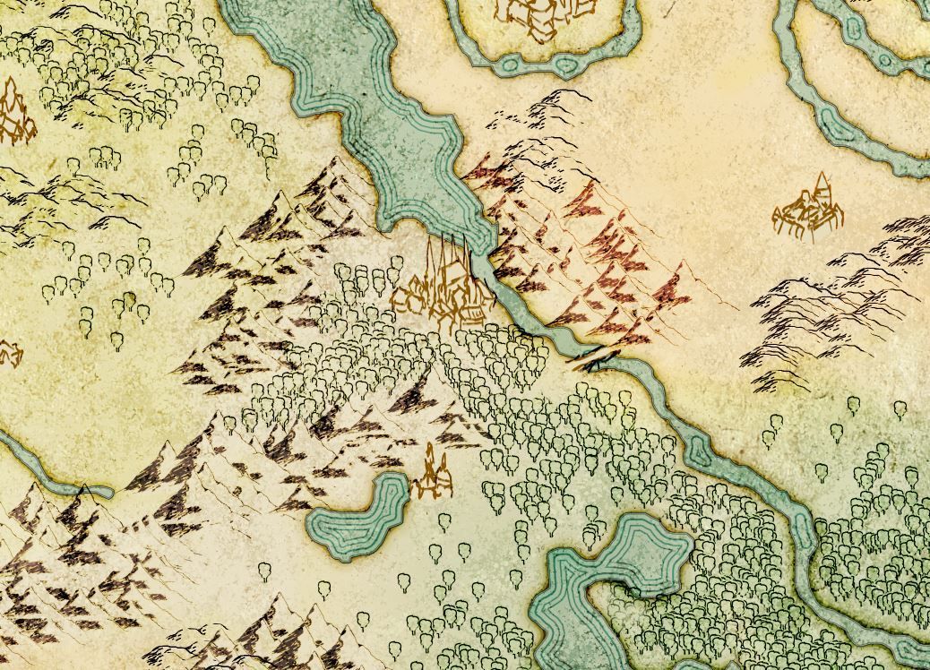
3. Forests, Hills and Mountains Placement
Placement of the terrain. For that I got marked areas by Scott he provided me first. This is pretty straightforward, painting that in as brushes in Photoshop. Just being careful not to paint too much to the edges of the lands, otherwise it would overlap to water. Though that happened here and there, which requires little touch-ups.
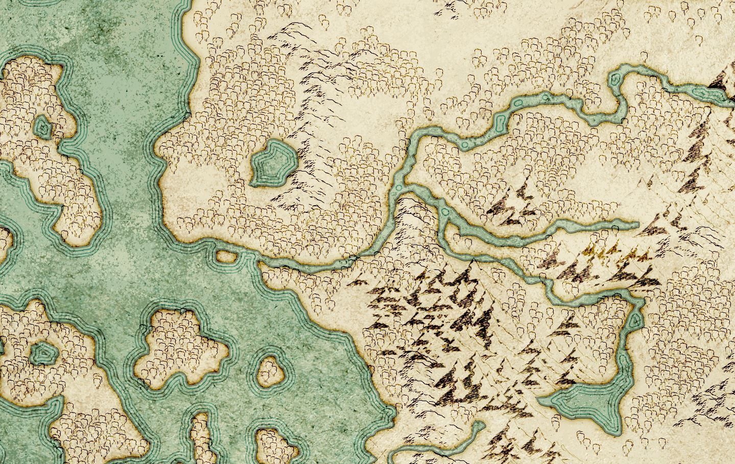
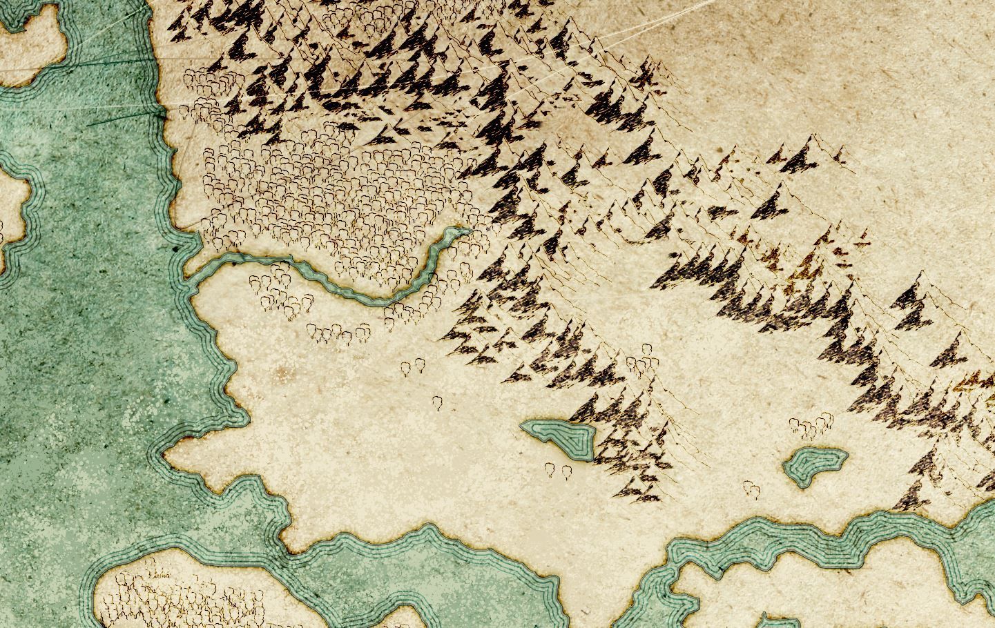
A zoom in on the different terrain placements.
4. Continent and Biome Colouration
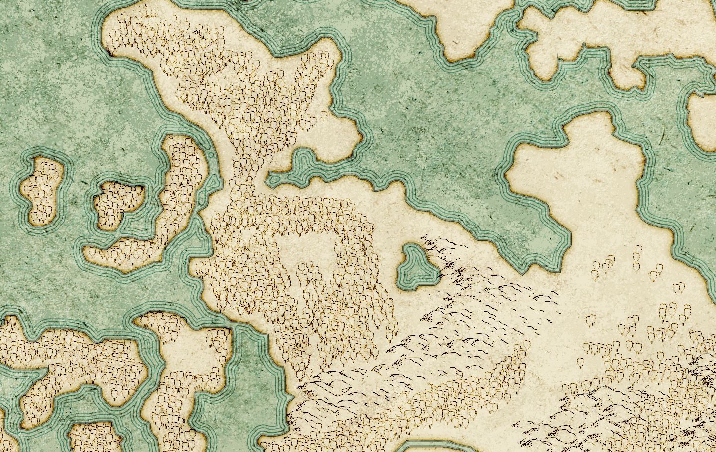
Colouration of the biomes. A new layer is created and set to colour burn as well. Then we paint in with very low opacity to not overdo it. Colours indicate the climate as well. One I did not add any colour and just used the base texture colour, was the desert areas.
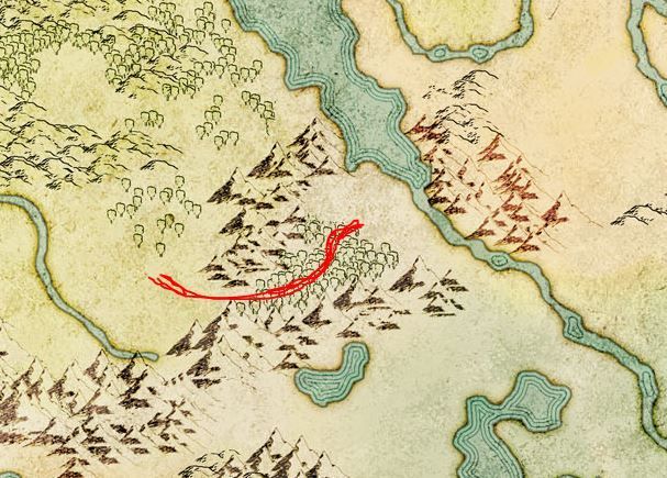
A little addition or fix to add a hint of a pathway to the bridge leading over the river.
5. Locations, Typography, Details and Touch-Ups
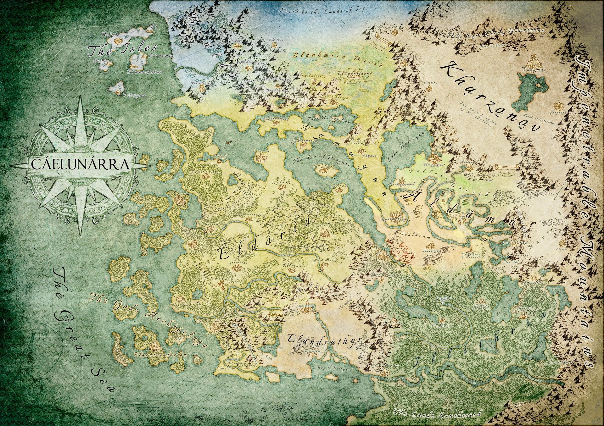


Next: Adding locations and towns, which are drawn out from the reference Scott provided me.
Plus adding typography, from the larger areas to the smaller locations, cities and towns. A few touch ups here and there by removing some trees to add hills and to get a little more space for some location names. Also we had to test out the font sizes to see which one is still readable in the original size of the map.
A very rough ink like compass is added in white with darker outlines. I only drew 1/4 of the compass, copy and pasted the parts, rotated and mirrored them to put it together like a puzzle. The space where the title of the map is located I used a paint brush stamp I did on a paper with acrylic black colour.
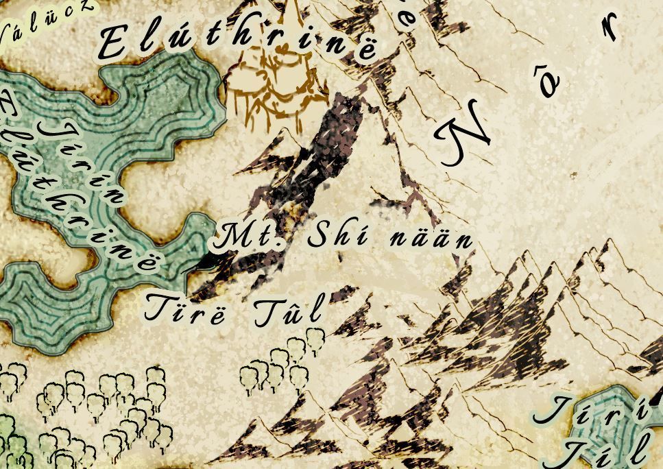
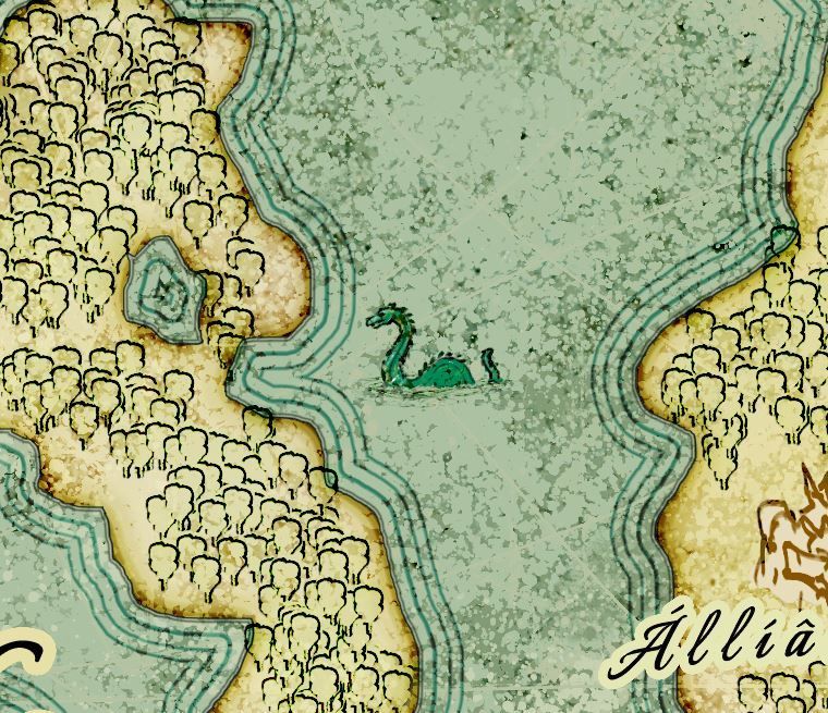
Touching up the mountain a bit to make it look larger and on the next slide, adding a sea monster scribble to indicate some being out in the sea that might be threatening towards anyone travelling.
6. Finishing up!
And this is the final chapter in this post.
The final file Scott got was a JPEG with dimensions of 10.000px to 7.000px.
After all, it was a great experience and this won't be the last time to work on map design.
Since I am diving deeper into it now, including new software to try, this will be very exciting for the future and it seems this will grow to be one of the big ones I will offer in the future, besides cover design and stand-alone artworks.
Make sure to give Scott Hatfield a follow on his socials:
Scott Hatfield the Author on Facebook
scotthatfieldtheauthor on Instagram
scotthatfieldtheauthor on TikTok
Check out his book and profile at Amazon: https://www.amazon.com/Shadow-C%C3%A1elun%C3%A1rra-Prophecy-Unleashed-Chronicles-ebook/dp/B0FGKD2QQ8?th=1&psc=1
Thank you for your time! Share this post, if you think this was helpful!^____^
Share this post!